Infographics Workshop
Lead by Gerry Kennedy
Personal Piece: Plane Window Infographic
5 min read 14.11.23
Infographics are really cool. Something I hadn’t taken interest in until Gerry’s first workshop. He explained how they worked and how the design of the graphics are heavily biassed towards the opinions of the creator. You need to be careful how you interpret the graphics and check the facts because they are often dramatised or swayed in one particular direction.
I always thought of infographics as boring posters with the literal intention of showing information clearly, no real design input from a creative perspective, only a literal one. Gerry’s workshop changed this perspective I had by showing us how people can get creative with infographics, making wild and cool visuals while still having a clear way of interpreting the data, using keys. These allow you to create anything you want as an infographic, then provide people with instructions on how to use them. He spoke about using type, colour and layout to structure an appealing graphic, as well as telling us the importance of making the information easy to digest, understand and conclude. This opened a massive creative door for me once Gerry gave us the brief for our investigation task, to create our own infographic.
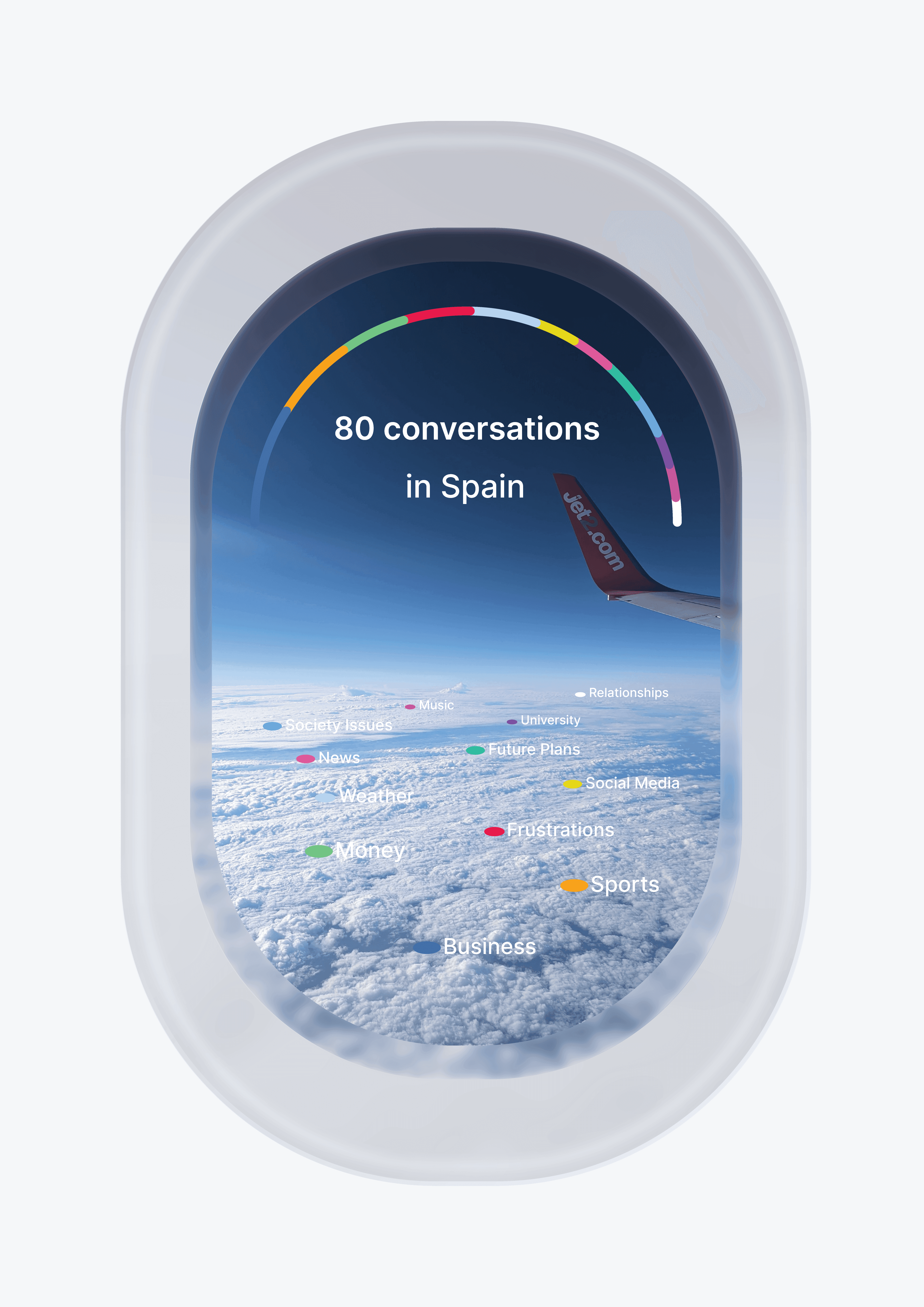
The information I recorded for my infographic was from a holiday trip to Spain the day after Gerry gave us the brief. It was a big family reunion so after some thought I decided the best information to collect would be the topics of conversations I had with people since I had not seen many of them for over 5 years. Over the 5 day trip I recorded 80 different conversations spanning 12 different topics, a solid data set for the graphic. I was struggling for a way to visualise the information, pondering for ideas on the plane journey home, staring out of the plane window in the hope an idea would come. Then It came to me, I could use the plane window as part of my infographic. It would be fitting with the theme and I could get creative with a UI style layout. I found a few examples of people who had carried out similar ideas and created my own infographic displaying my information. I used colours to create a key for the information and positioned it within the graphic itself, like location markers along the clouds. To help visualise the most popular conversations I created an arc over the top of the window and split it into sections depending on conversation frequency.
Overall I was happy with how this graphic turned out considering I had no clue how to visualise the data 24 hours prior to making it.

Misleading Information
Gerry explained to us how infographics are often twisted, biased narratives to drive home a specific point or side of an argument. For this reason it is really important to validate the quality and legitimacy of the information you are displaying, allowing for the argument to be one sided but not too the point where you are creating extreme scenarios that are either misleading or purely fake. The best approach when making an infographic is to form your argument strongly but read over the information a few times and see what conclusion you come to, if it is not true then you have either made it up or swayed the argument too far one way.

Information Verification
This is the most important step before creating an infographic. The information you display should be verified from real and accurate sources before formatting your work. As communicators we hold the responsibility for spreading accurate and proven information to people so making sure we have our facts right is step one of any design process. By doing good and thorough research we can go into the design process with confidence that we know our stuff and can communicate the ideas clearly.

Keys
Keys are often needed in infographics to tell people what is happening. The most basic examples is a map key, a list of icons, colours and images that you can connect to points on a map so you know what each thing means. Another examples is colour by numbers books which use keys to connect a number to a colour on a drawing. Complex and abstract infographics will always need keys to be understood, it is a way to unlock the information taking it from a piece of design to digestible information.

Clear communication
Great infographics can communicate lots of information clearly but there is still such thing as too much information. Infographics should communicate relevant groups of information surrounding a specific point, so cutting out the fluff from your information is the best place to start. If it doesn't reinforce of relate to the topic or opinion you are trying to display then don't put it in the design.

Featured Artist: Arkadiy Lapshov
Profession: UI/UX & Product Designer
Arkadiy is a senior UI/UX designer meaning the core of his skills lie in communicating information to masses of people in a clear and concise format. I love the simplicity of his work and his ability to communicate so much through so little all while keeping a clean aesthetic in his work. One piece that caught my eye was his plane window UI component. The idea was really clever and I wanted to replicate something similar using the information I had gathered myself. I think UI/UX designers are really large scale infographic designers because their jobs involve communicating lots of info in an organised and clear manner, especially in app design.


