InDesign Workshop
Lead by Alex Gillot
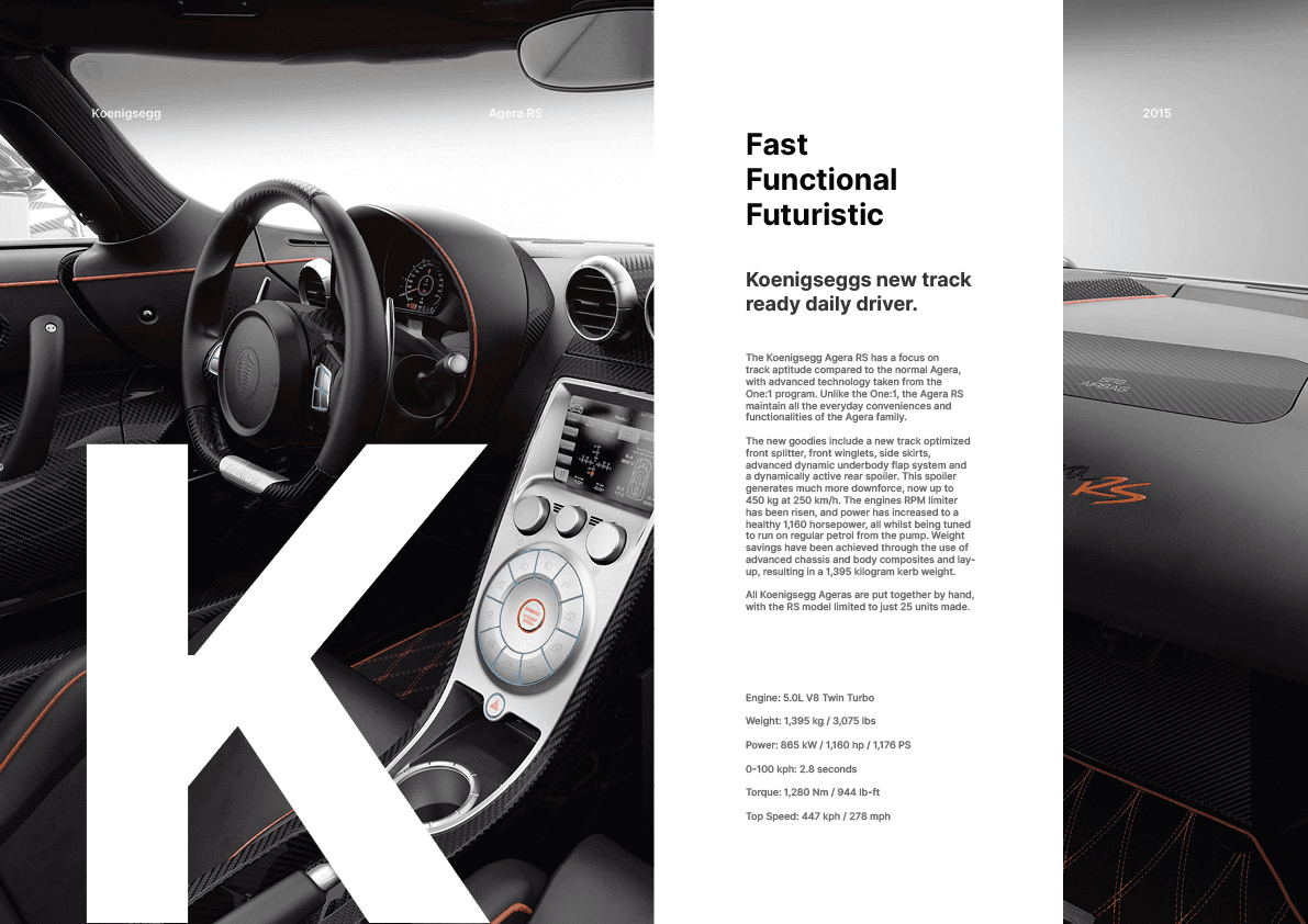
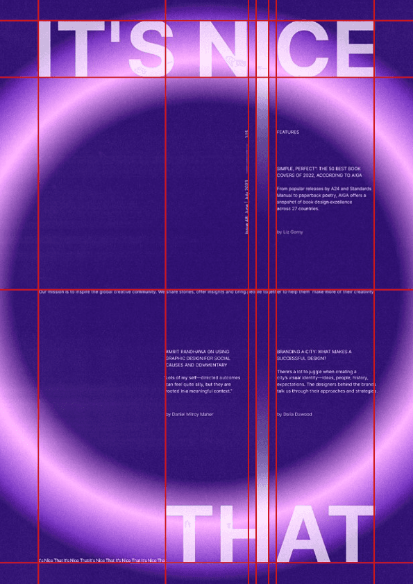
Personal Piece: Koenigsegg Spread
4 min read 17.10.23
This was the last of Alex’s workshops,InDesign. In this workshop he covered the importance of the fundamentals when it comes to laying out compositions for print and digital. He covered the different colour formats like CYMK, RBG and Pantone, explaining their uses in industry. We also covered the importance of grids in design layout, learning how they can be used to create appealing compositions, avoid printing errors and help you create an immersive visual experience for a user. Type is a massive part of composition layout for zines, posters and spreads so understanding how to position type effectively was another important learning factor. Alex explained the terms Kerning, Leading and Tracking to us and their significance when creating legible copy for our designs. Going further into typography, we looked at how to lay out and structure copy on a page. From small things like point sizes to widows and line length psychology, we covered everything that needs to be considered when positioning paragraphs of copy for maximum aesthetic appeal and readability.
My final piece for this workshop focused on developing my understanding of good layouts and using grids to create spreads/zines. I took inspiration from a Behance project I stumbled across during my research. (I have featured their work below) I liked the layout they used creating 2 segments and laying 1 image across both, leaving a gap for a column of text in the middle. I copied this layout using an 8x8 grid format with 2mm margins all around. I felt the outer margins were too thin so I bled the images over the margin to create a seamless look for the image. I created hierarchy with the text using Inter at different weights, sizes and tints to create clear structure throughout the columns. Similar to the design I took inspiration from, I added a large ‘k’ to the leading page as a type element for the design, in addition to 3 smaller pieces of text running horizontally across the spread as some finishing touches. Overall I was very happy with how this turned out and feel confident in my ability to use grids, hierarchy, type and layouts to create effective compositions.

Copy Alignment
Alex outlined the importance of aligning copy and paragraphs correctly when making zines and spreads. The main thing to look out for when formatting copy is widows, these are spare words that don't take up a full line. The best guidance is to leave no more than half a line of space on the last line of copy and never leave 1 word on its own. Columns of text should not exceed 85 characters for readability purposes and allowing the page to take good structure.
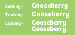
Type Adjustments
There are some important techniques to know when formatting type in a composition or layout. Kerning is the space between letters in a word, tracking is the even spacing of letters in a whole word and leading is the gap between lines in a piece of copy. Together these techniques can be used to increase type legibility and flow in different pieces of writing.
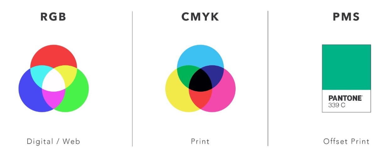
Colour
Alex showed us the importance of using the correct colour settings in our work. As all monitors are different in terms of colour interpretation it is important to use set colour codes and settings to make sure everyone can see the work as it is. Pantone is the industry standard for colour codes and great for looking at colours with clients without needing to be present with them. RGB is the best format for digital colour accuracy and CYMK is best suited for print.
Layouts & Grids
The biggest takeaway from Alex's masterclass was the importance of using grids and layouts when making posters and compositions. Using these allows you to create structured and aligned work as well as let people navigate your work how you want. Grids do not have to be perfect square layouts which is what makes them interesting to use as you can experiment with different structures. Good grids are formed around the content of the poster itself for example using letter thicknesses as guides to align smaller copy to. It creates what appears to be a random layout but everything is still aligned clearly.

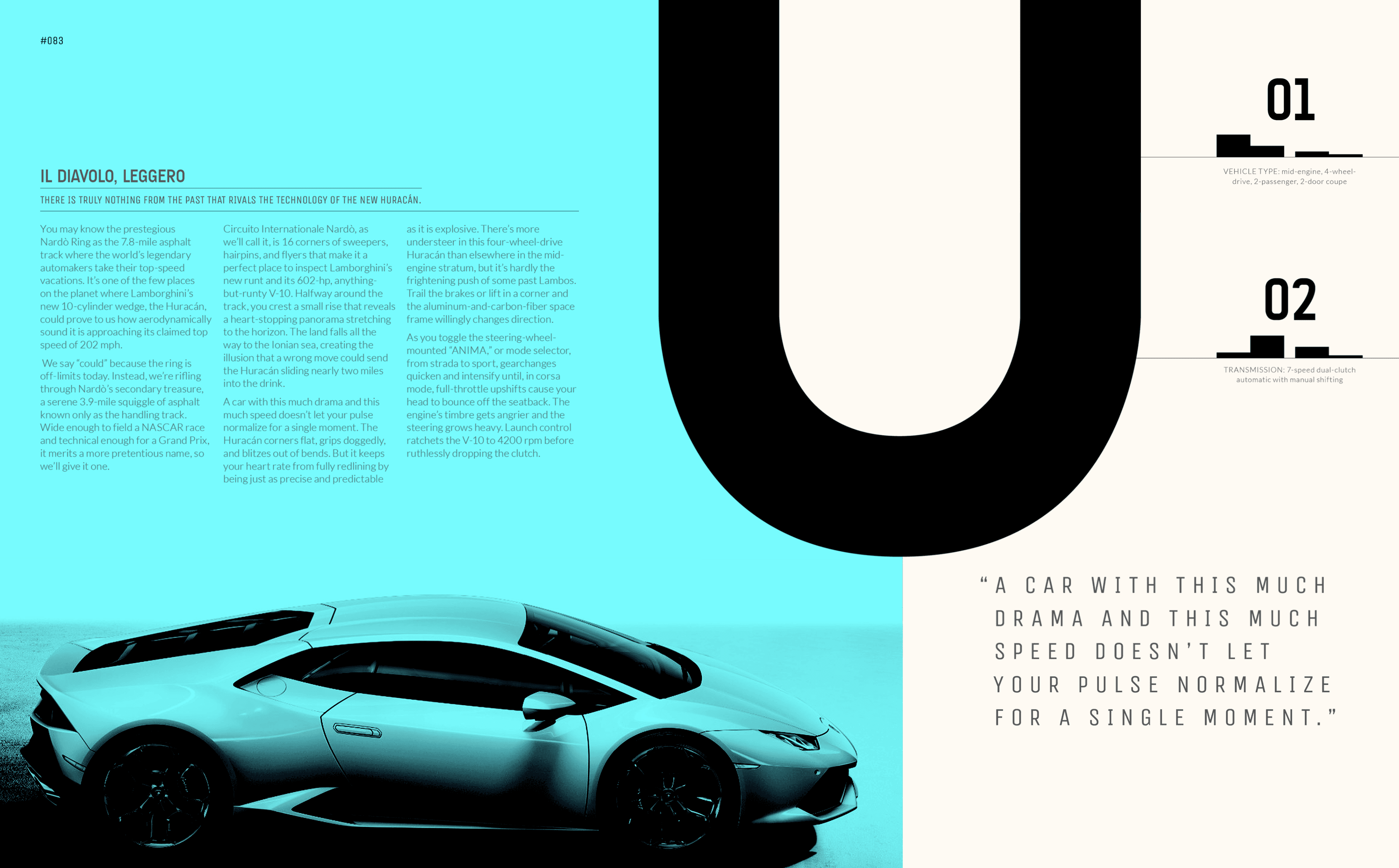
Featured Artist: Tevin Bloise
Profession: Full Stack Graphic Designer
Tevin is a full stack designer focusing on a range of disciplines like brand identity, zine making and logo design. When looking for design inspiration I came across the work he did on some Lamborghini zines. Ioved the simplicity of the layouts he used and he use of large lettering to break up the page while adding a nice, bold visual element to his work. I studied the layouts he used and applied them into my own experiments as a guide for structuring my work.