Packaging Workshop
Lead by Alex Gillot
Personal Piece: Creative Conscience Design
5 min read 13.02.24
Alex’s packaging workshop spanned over 3 weeks, letting us develop an understanding of the basics required to create good packaging designs as well as drawing knowledge from his experiences with agencies, creating designs for both Asda and Walmart. He introduced us to different packaging approaches, explaining ideas behind illustration and text placement in terms of creating an eye-catching visual, as well as the practical applications surrounding relevant product information and labelling, in line with industry standard regulations. We looked at design systems within packaging, outlining how illustrations and colour can be used to create consistent systems across a range of goods and items, allowing for differentiation in areas like flavour, quantity and contents, while still creating a cohesive and recognisable packaging range that was directly linked to the brand in question. After a quick introduction Alex led us through the packaging design process, outlining each phase so we could understand the method behind each design and the importance of each stage in
the development. We followed a process from initial research and analysing competitors, before moving onto idea generation, some sketching and finally some visualisations with colour, using nets and diagrams to mock up the packaging. The goal was to get us thinking about how we could display elements within the given package dimensions to allow the design to stand out on a shelf against its competitors, catching the eyes of its target audience. Some areas of the process were familiar, like the logo design and identity process, but the big differentiator was exploring the principles of well designed packaging and the psychology behind audience interpretation and in question. After a quick introduction Alex led us through the packaging design process, outlining each phase so we could understand the method behind each design and the importance of each stage in the development. We followed a process from initial research and analysing competitors, before moving onto idea generation, some sketching and finally some visualisations
with colour, using nets and diagrams to mock up the packaging. The goal was to get us thinking about how we could display elements within the given package dimensions to allow the design to stand out on a shelf against its competitors, catching the eyes of its target audience. Some areas of the process were familiar, like the logo design and identity process, but the big differentiator was exploring the principles of well designed packaging and the psychology behind audience interpretation.

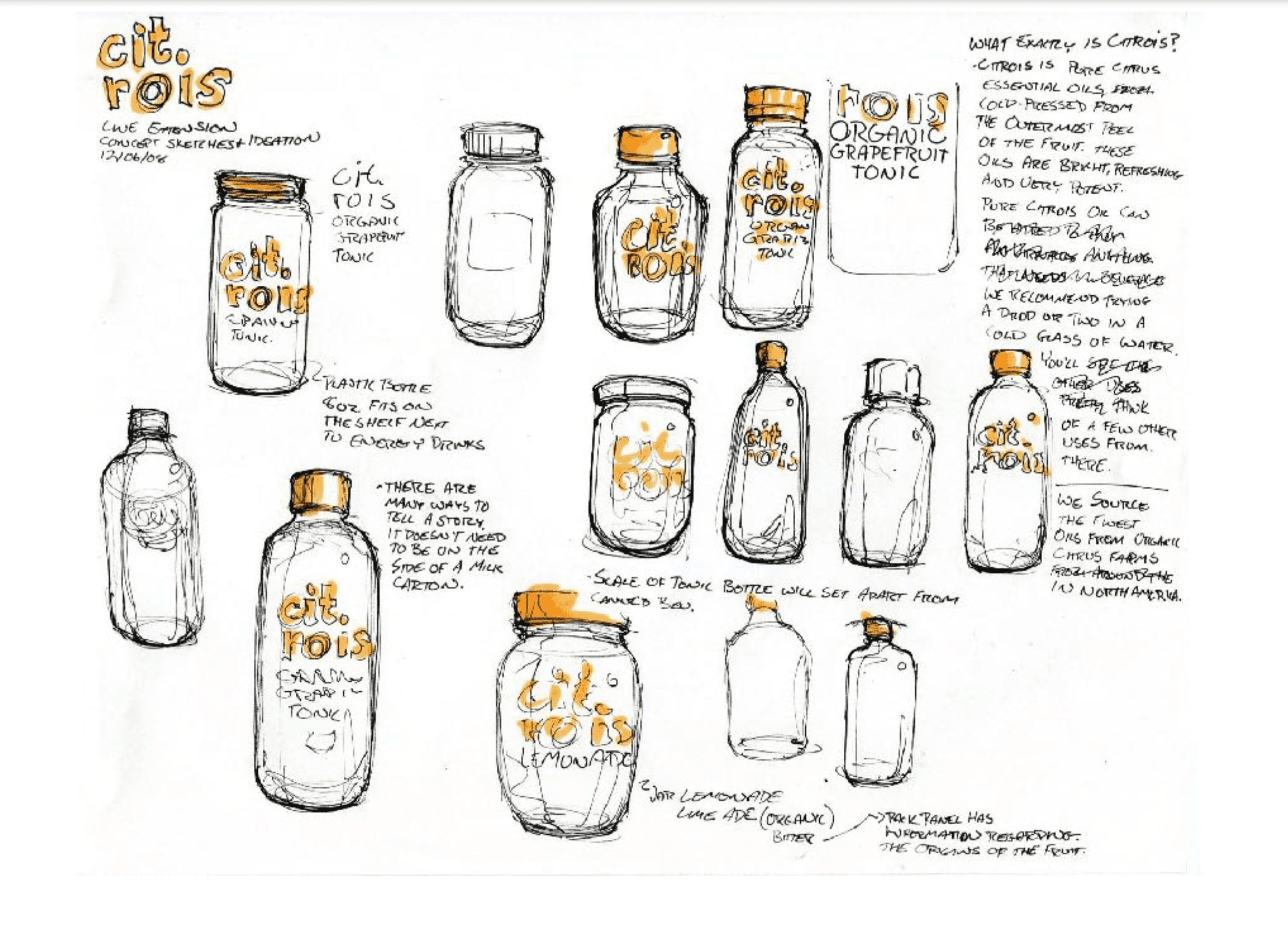
Packaging Systems
Building packaging systems is important when dealing with multiple brand products. A system is a set design style allocated to a brand which is flexible across and entire range of surfaces and packaging shapes, allowing the brand to stand in unity with its visual identity as well as give customers info of different products and flavours.
Packaging Process
Like all design disciplines, packaging has a process. It starts with sketching out various possibilities and directions, followed by the visual identity design and finally the packaging design. The visual identity helps inform the packaging design decisions and gives us a set of assets to work with when creating the designs. Not complete creative freedom but enough to land on some interesting ideas and make sure the packaging stands out on the shelf.

Cohesive Ranges
Cohesive ranges are important for all brands who package their products. The different packaging systems must contain similar features allowing them to be cohesive and unite as part of one brand. This is usually achieved through the placement of a logo system to identify the brand and a fitting typeface, with colour being used as a way of differentiating the different product ranges.

Shelf Appearance
This is the make or break for a packaging design. If it doesn't stand out on the shelf then it simple will not make an impact in a real world scenario. Shelf appearance takes into account where the packaging will sit on the shelf as well as the colour schemes/design styles of the products competition, allowing for calculated design decisions to be made resulting in the creation of a stand out and impactful packaging design.

Creative Approaches
Like all design disciplines, getting creative is the number one way to stand. This applies widely to packaging as you have so much more freedom than a logo and colour palette, you can influence the structure of the packaging containers which can have a huge impact on product success, especially if you can create a structure far beyond the generic outcomes of the competition.

Featured Brand: Brandon
Profession: Brand Strategy and Packaging
Brandon are a design consultancy agency based in the UK. They actually came in to speak to us about the work they did and it was short of inspiring. They showed us their case study for Pizza Express, outlining the strategy behind their packaging approach, the process involved and the creativity the team used to execute on the brief. Their work is top tier and I will definitely look to them for packaging inspiration in the future.


